For the 2016 iteration of the Hitman franchise, simply titled HITMAN™, Io-Interactive and Square-Enix decided a much different approach to the series by releasing it in an episodic format with an emphasis on iterative gameplay.
With each level serving as a big, swiss cheese sandbox touting hundreds of ways to approach every mission, an always-online requirement, a litany of player challenges and a constant flow of new content in the form of additional missions and time-limited elusive targets, this also created a number of challenges on the UI front. As a result, the Online and UI teams were tightly integrated, and even after the release of Season One, the UI was constantly iterated upon.
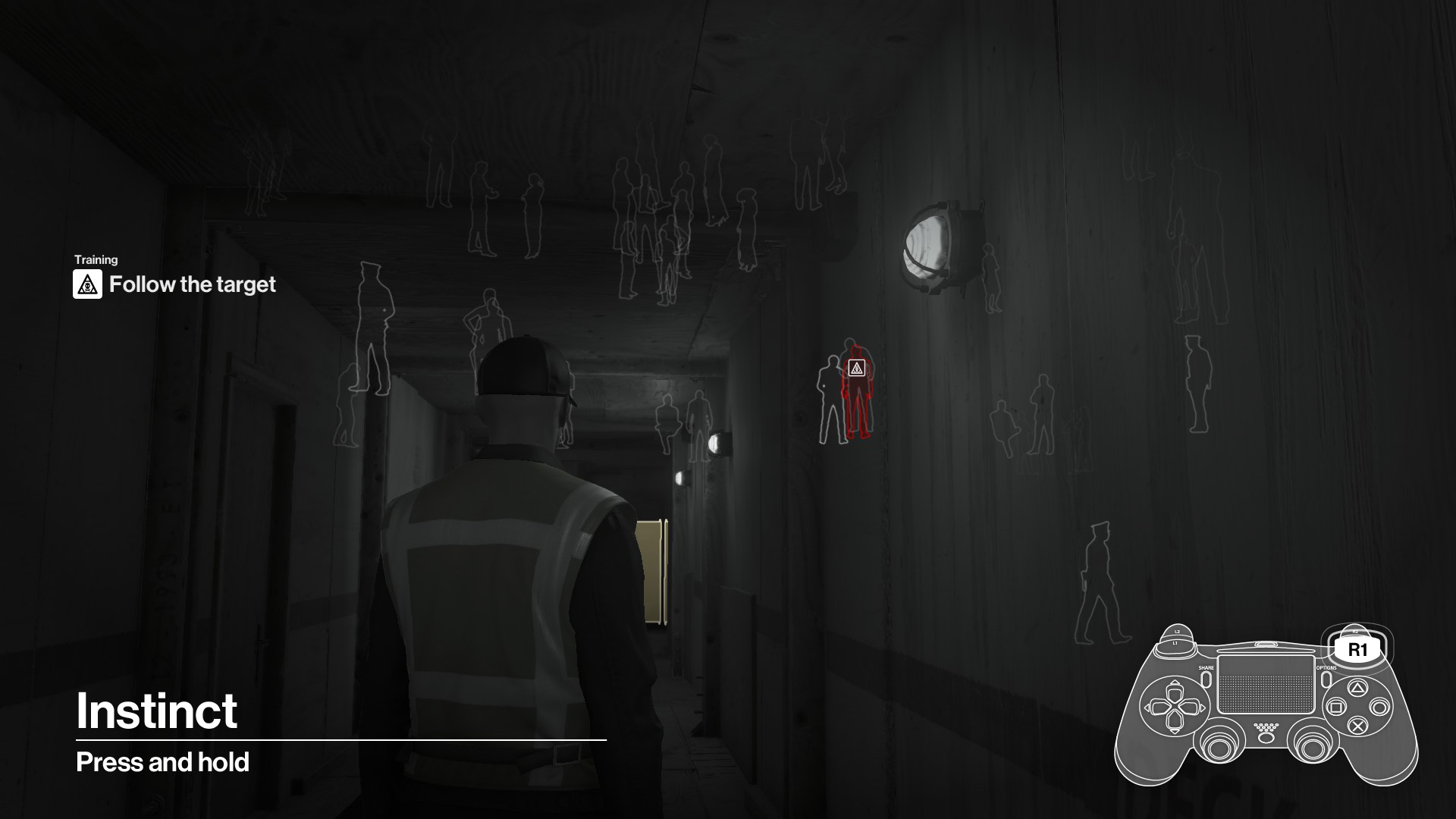
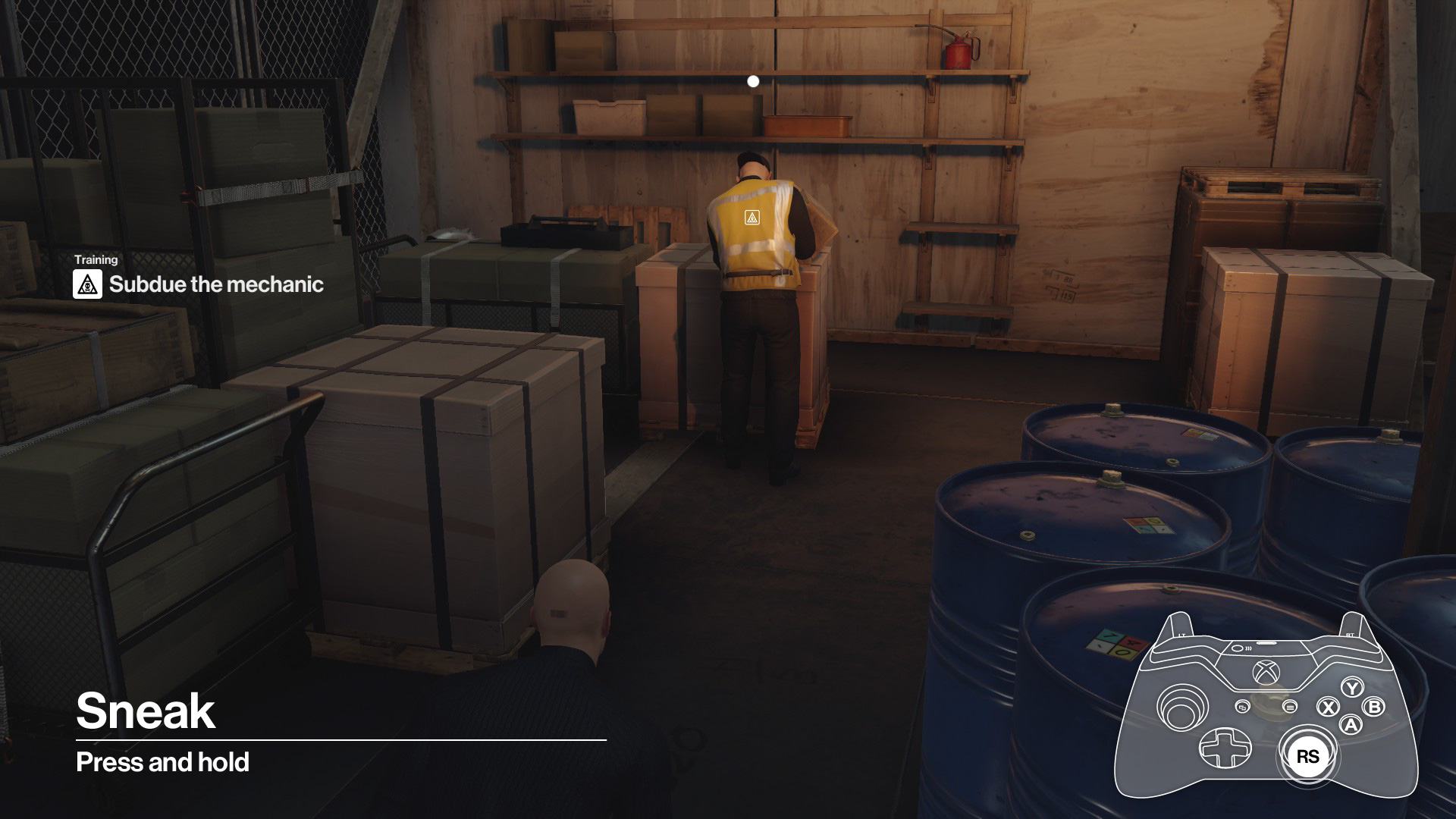
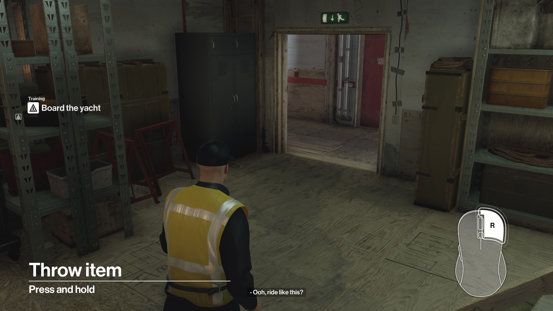
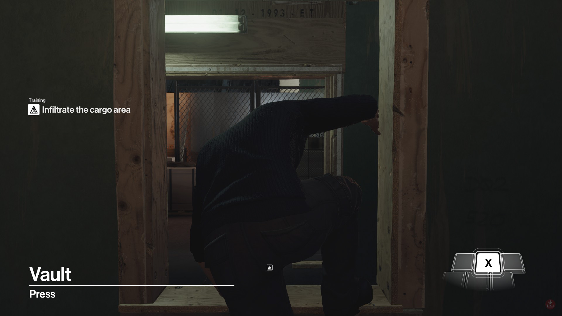
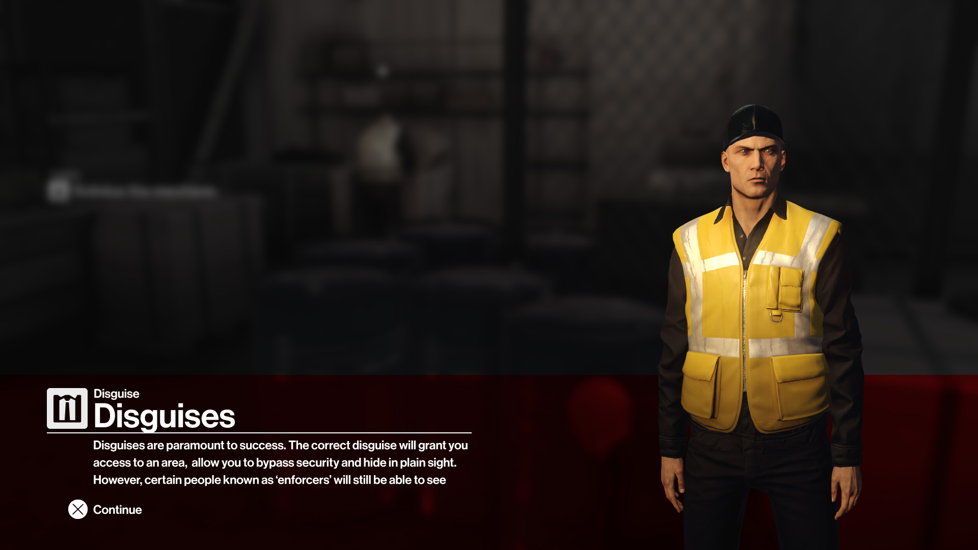
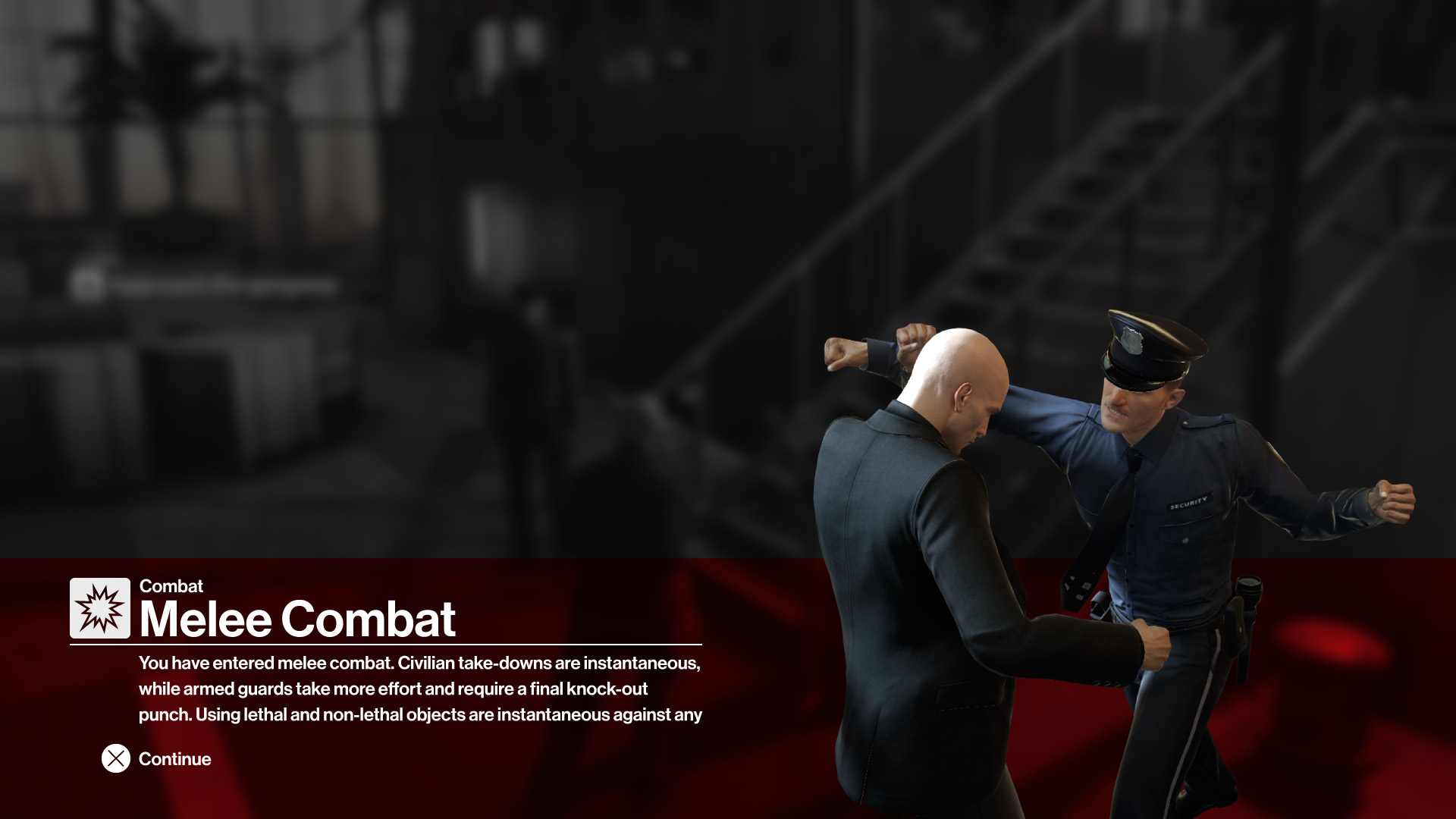
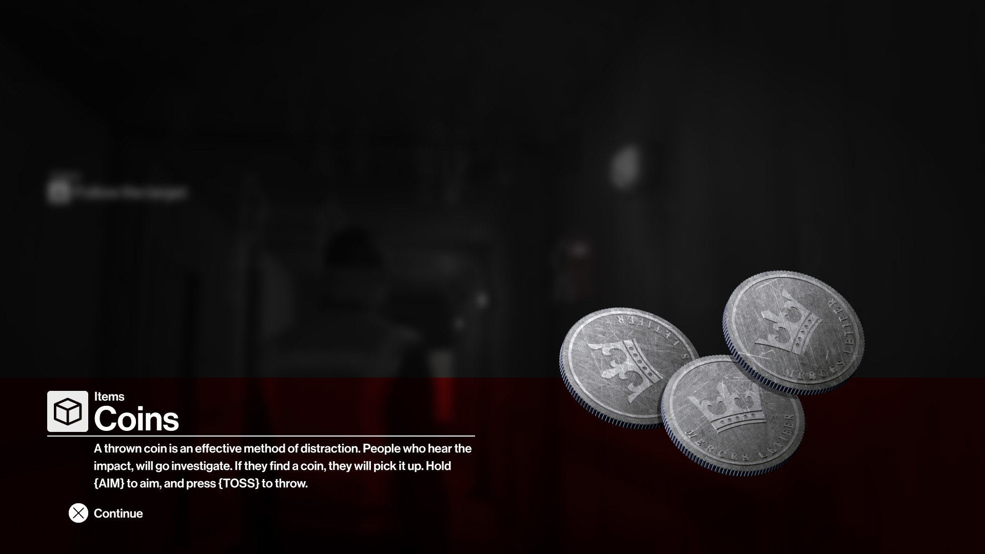
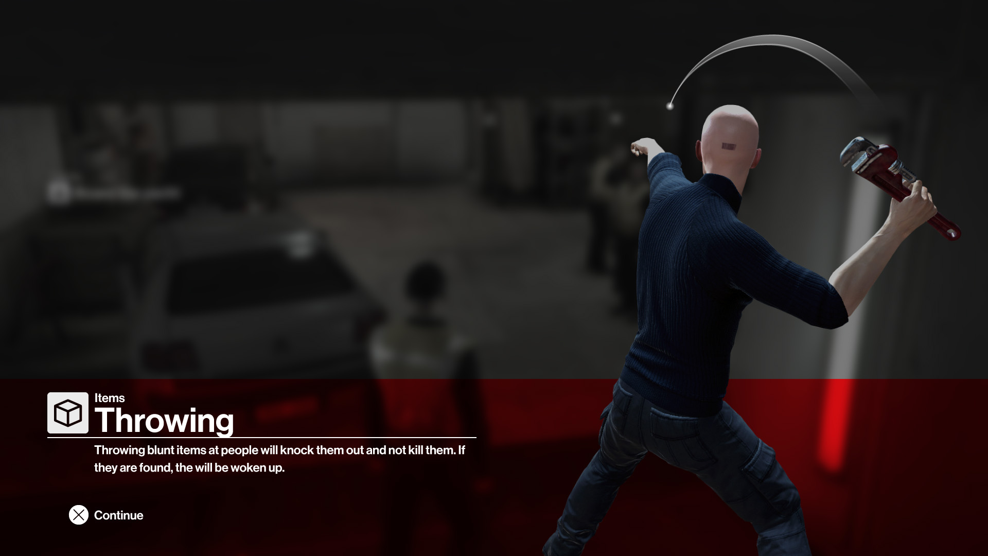
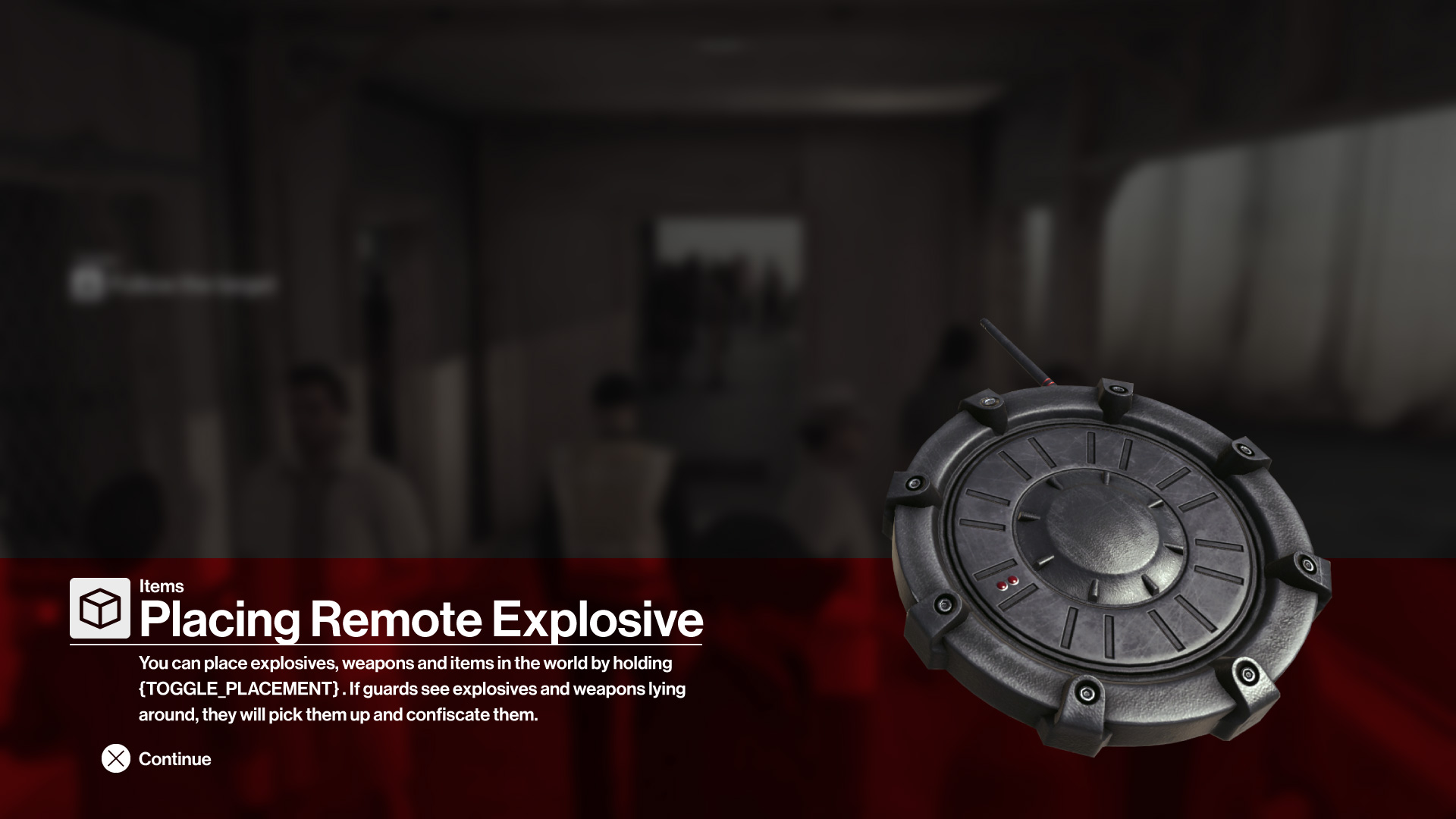
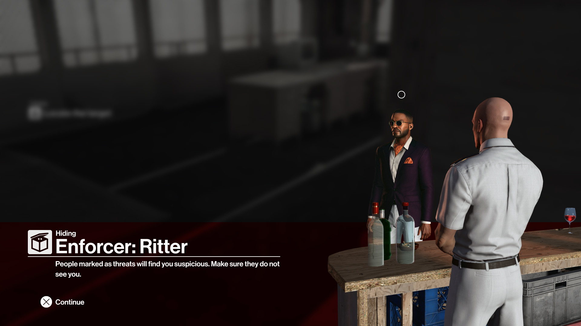
I was responsible for redesigning the tutorial, designing a new splash hint system and creating several graphical assets for these, as well as other HUD elements and icons.
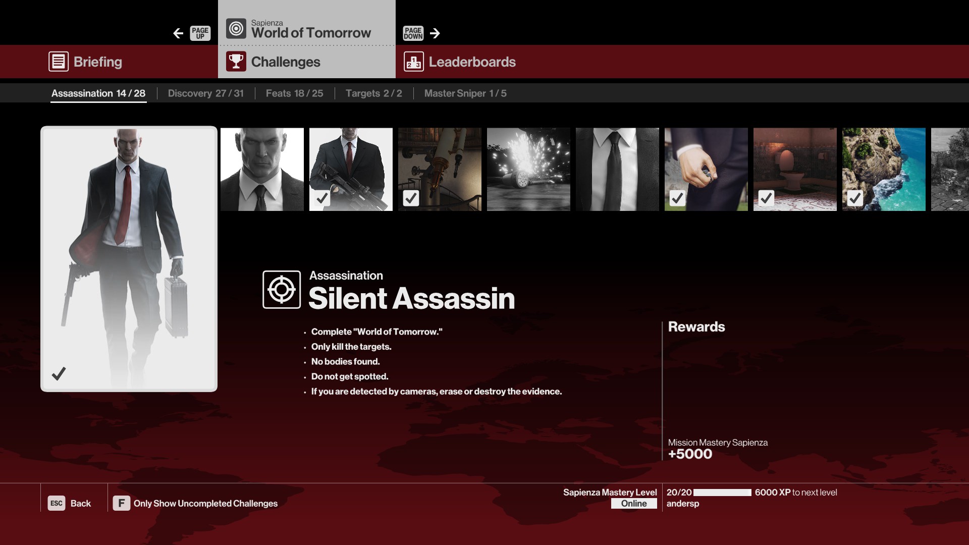
I was also responsible for documenting and identifying improvement areas in the massive UI that encompasses hubs, challenges, leaderboards, user contracts, elusive targets, career tracking, destination and mission selection, story overview, briefing, debriefing, planning and loadout, mastery progression and dozens of other menu components.
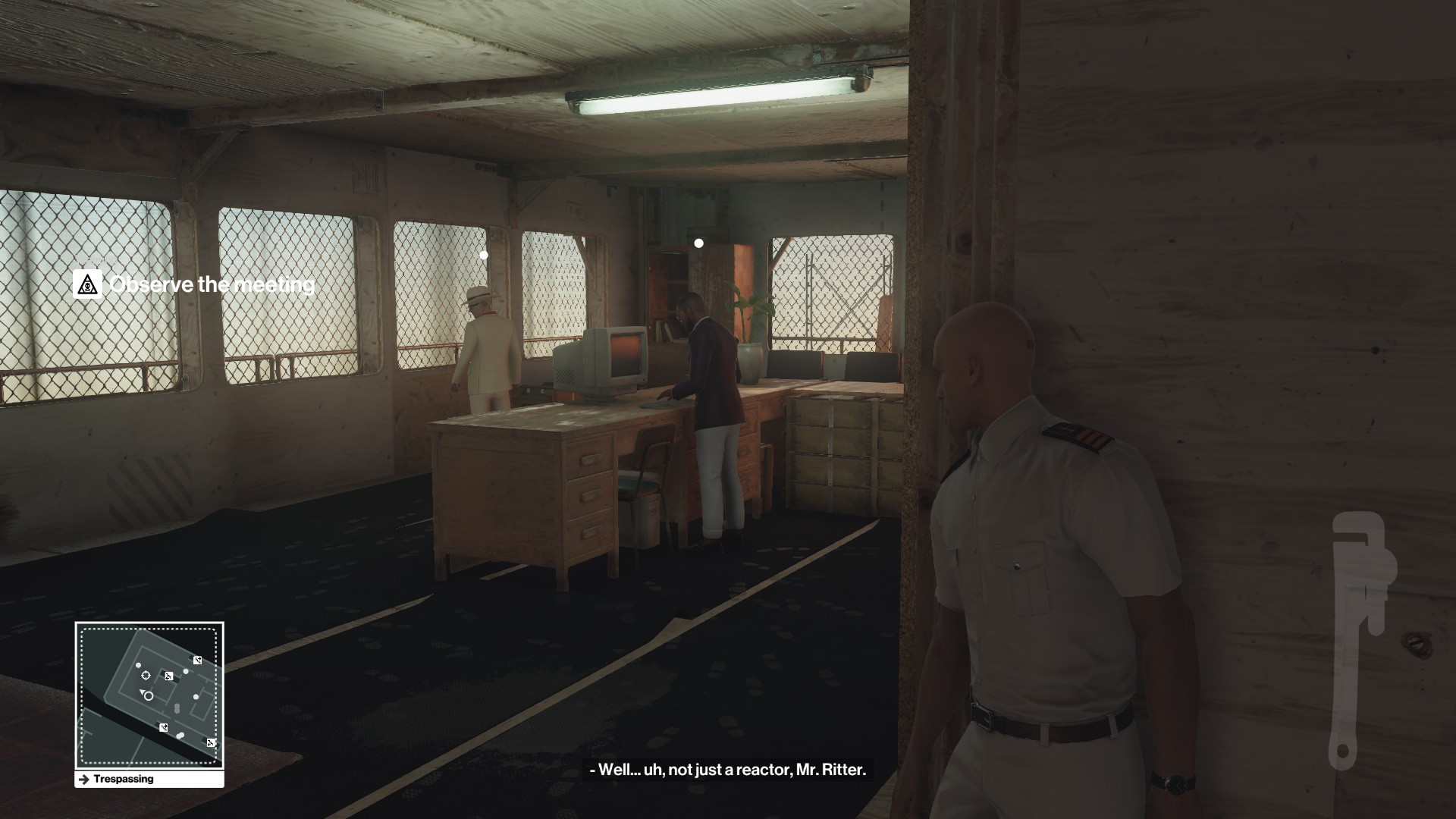
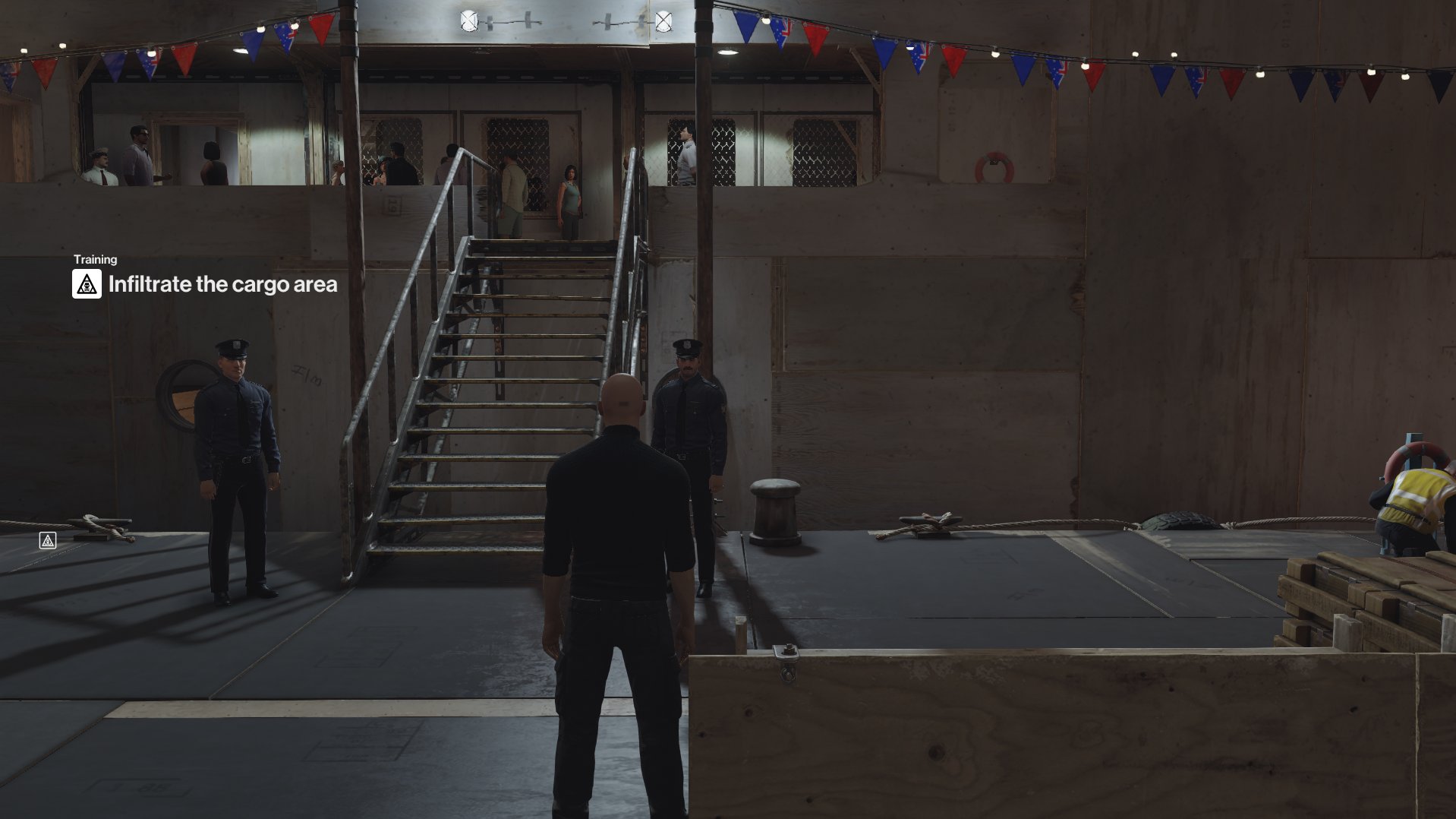
Tutorial
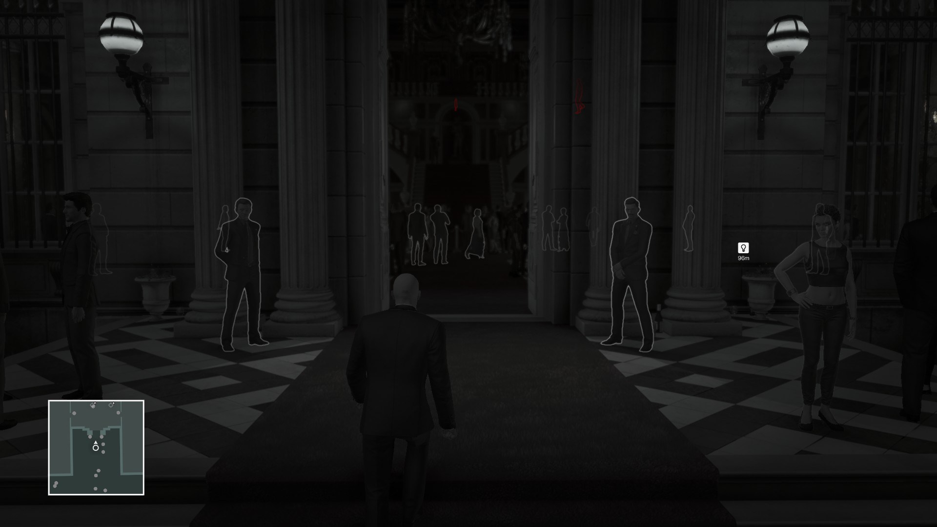
Splash Hints
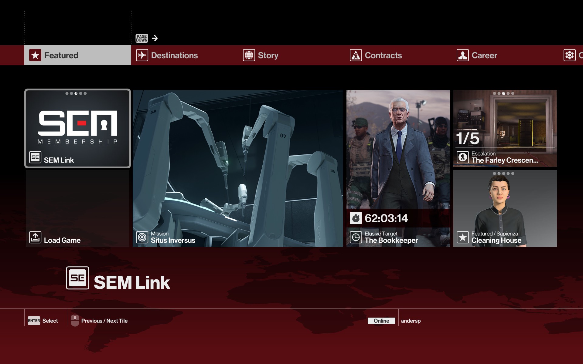
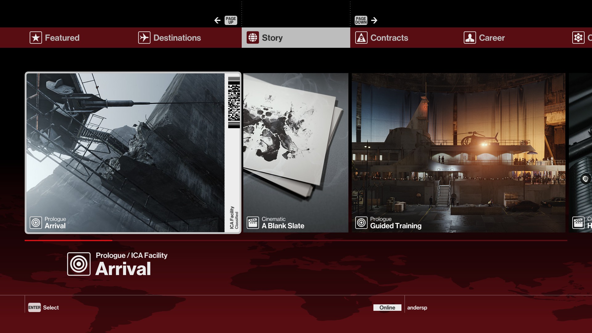
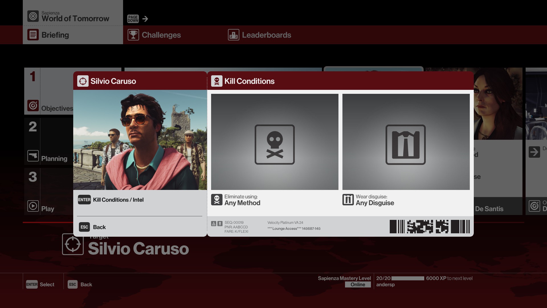
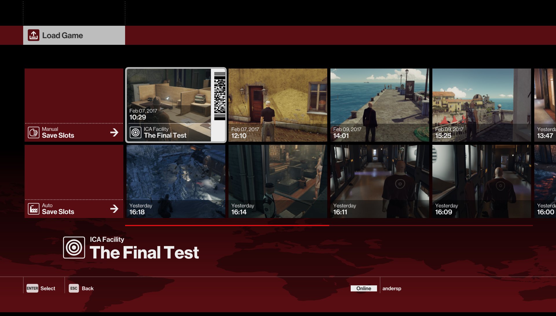
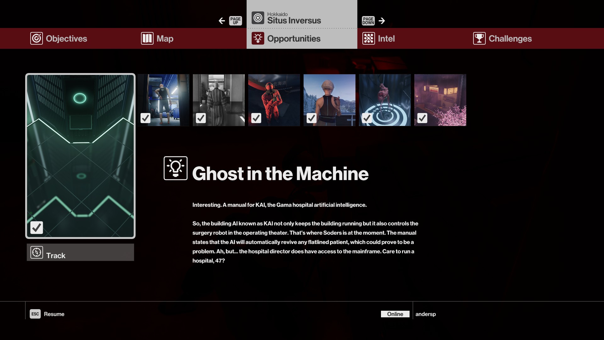
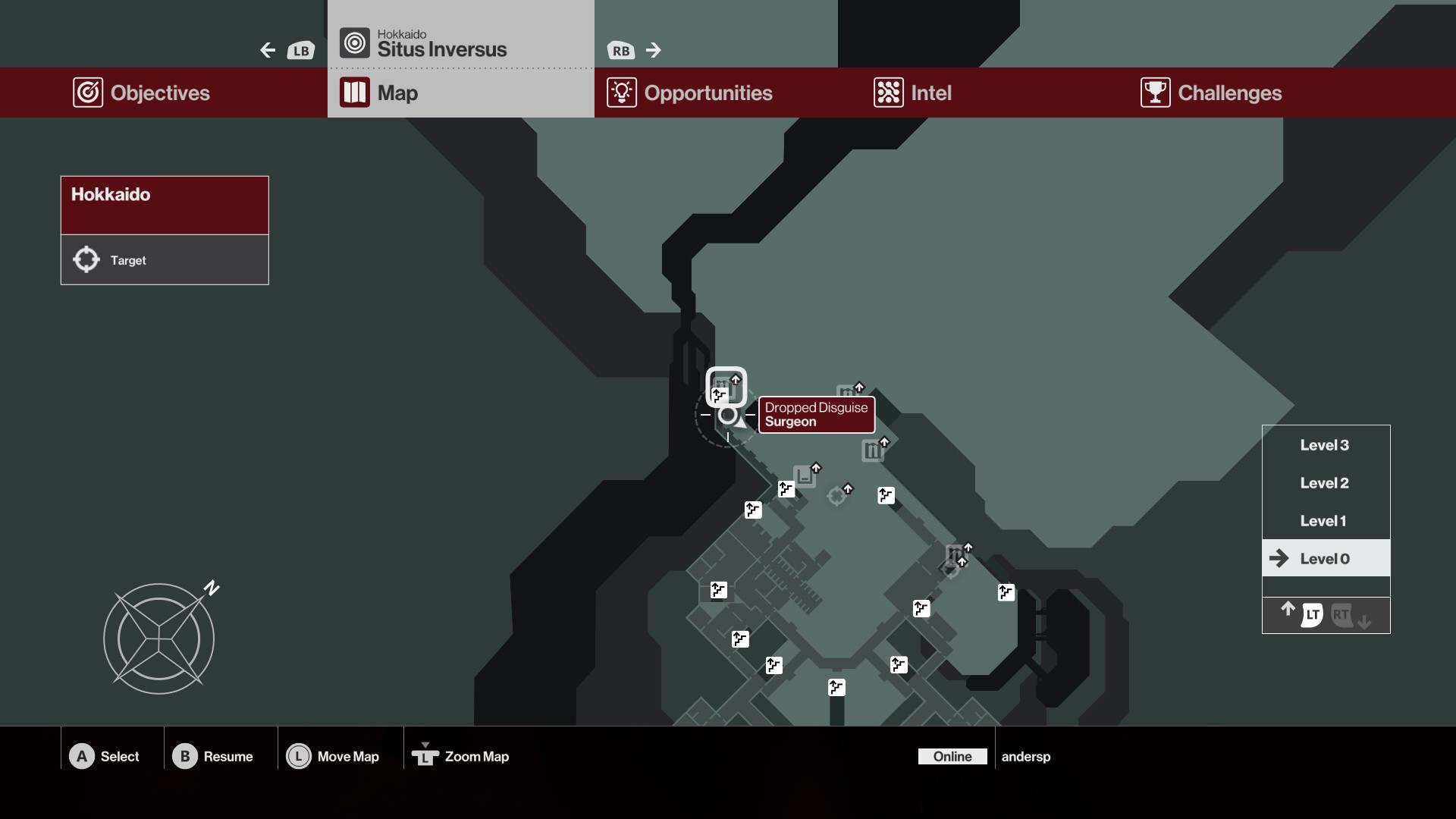
Menus
The menus were done by the UI team without my involvement, but it’s included here for context.
The general art direction of this iteration of Hitman switches things up from the grungy, exploitation film-inspired predecessor, to something very exclusive, slick and composed. The design of the UI is instrumental in achieving this feeling. Due to the massive amount of content, the tile based approach puts that content front and center.
HUD